
Sometimes the best way to understand the world is through visualization of images.

Max Roser
There’s a wonderful web site called Our World in Data, developed by a researcher at Oxford University named Max Roser. The site covers a wide range of topics and visualizes the empirical evidence of how living standards have changed over decades, centuries and millenia.
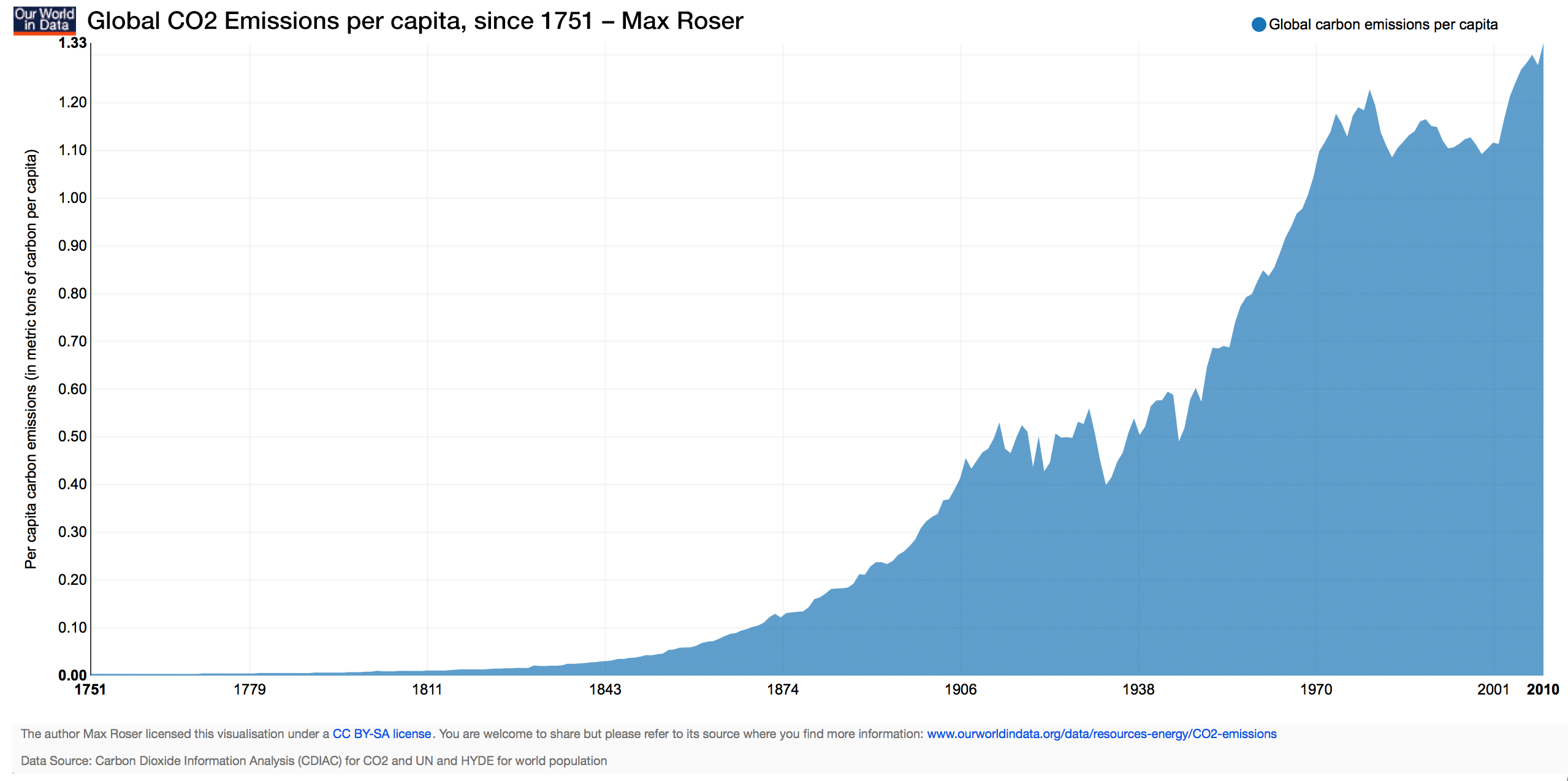
One set of extremely compelling charts describes increases in CO2 emissions over time. The chart below shows CO2 emissions per capita since 1751.
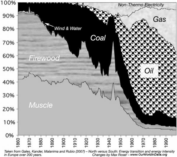
The chart below shows European energy use over the last 150 years, and the transition from “muscle” to firewood to coal to oil to gas over time.
Highly recommended, with many charts relating to energy usage and global warming, and many other topics as well.


Thank you for all that you are sharing..I continue to learn from each one of your postings..I live in the West Virginia Frack fields…My sincere thanks for what your are doing…
Thanks for your kind words. It’s important for all of us, no matter where we live, to help each other deal with the issues created by oil and gas expansion.